
Choosing wall colors that harmonize with natural light can dramatically transform your living space, affecting mood, perception of size, and overall ambiance. Daylight is a dynamic element, shifting in intensity and color temperature throughout the day. Understanding how different colors interact with these variations is key to creating a visually appealing and comfortable environment. This guide offers a step-by-step approach to selecting wall colors that maximize and enhance daylight in your home.
Understanding Daylight and Its Impact
Daylight isn't static; it changes considerably from morning to evening, and even varies depending on the season and weather conditions. Morning light tends to be cooler, with a bluish tint. Midday light is typically the brightest and most neutral. As evening approaches, daylight becomes warmer, casting a golden or reddish hue. These variations significantly influence how wall colors appear. A color that looks vibrant in the morning might appear muted in the afternoon, or even take on a different tone entirely in the evening.
Consider the orientation of the room. South-facing rooms generally receive the most consistent and intense daylight throughout the day. North-facing rooms, conversely, receive softer, cooler, and more indirect light. East-facing rooms are bathed in bright morning light, while west-facing rooms experience warmer afternoon and evening light. This understanding is crucial for predicting how colors will behave in each specific space.
Assessing Your Space and Lighting Conditions
Before even thinking about specific colors, take stock of your existing space. What are the primary sources of daylight? How large are the windows, and what direction do they face? Are there any external obstructions, such as trees or buildings, that block or filter the light? Note the existing architectural features, such as trim, flooring, and furniture. These elements will influence your color choices and ensure a cohesive design.
Spend time observing how daylight enters and moves through the room at different times of the day. Notice the intensity and color temperature of the light. Pay attention to the areas that receive the most light and those that remain in shadow. Taking photographs throughout the day can be helpful in documenting these variations and making informed decisions.
Color Psychology and Its Role
Color psychology plays a significant role in how we perceive and react to our surroundings. Colors can evoke different emotions and influence our mood. Light colors generally create a sense of spaciousness and airiness, while darker colors can make a room feel cozier and more intimate. Warm colors, such as yellows, oranges, and reds, tend to be energizing and stimulating, while cool colors, such as blues, greens, and purples, are often associated with calmness and relaxation.
Consider the purpose of the room when choosing colors. A bedroom, for example, might benefit from calming cool colors that promote relaxation, while a home office might benefit from energizing warm colors that enhance focus and productivity. Understanding the psychological effects of color can help you create a space that is not only visually appealing but also supports your well-being.
Selecting the Right Color Palette
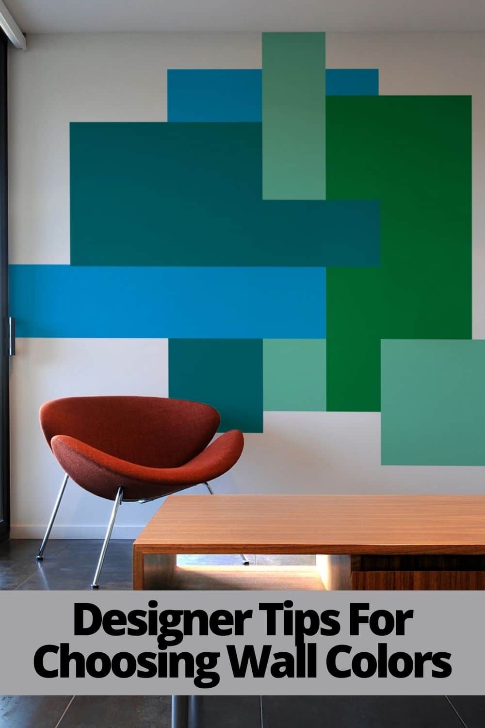
When selecting wall colors, start by considering the overall color scheme you want to achieve. Do you prefer a monochromatic palette, using different shades of the same color? Or do you prefer a more contrasting palette, using complementary or analogous colors? A monochromatic palette can create a sense of harmony and serenity, while a contrasting palette can add visual interest and excitement.
For rooms with limited daylight, opt for light and reflective colors that will bounce light around the space. Whites, creams, and pale pastels are excellent choices for maximizing brightness. Consider using a slightly warmer tone to prevent the room from feeling too cold or sterile. For rooms with abundant daylight, you have more flexibility in terms of color choices. You can experiment with bolder colors or deeper shades without making the room feel too dark or enclosed. However, be mindful of how these colors will appear under different lighting conditions. Sample colors are essential to the selection process.
The Importance of Sheen
The sheen of your paint also affects how light is reflected in the room. Higher sheen paints, such as gloss or semi-gloss, are more reflective and will bounce more light around the space. However, they also tend to highlight imperfections in the walls. Lower sheen paints, such as matte or eggshell, are less reflective but provide a smoother and more uniform finish.
For rooms with limited daylight, consider using a higher sheen paint on the ceiling to maximize light reflection. For walls, a matte or eggshell finish is generally preferred for its smooth appearance and durability. Avoid using high-gloss paints on walls unless you are looking to create a very specific and dramatic effect. Select the appropriate sheen based on the room's function and the desired aesthetic.
Testing Colors Before Committing
Never commit to a color without testing it in the actual room. Purchase small sample pots of your chosen colors and paint large swatches on the walls. Observe how the colors appear at different times of the day and under different lighting conditions. Move the swatches around the room to see how they interact with different surfaces and architectural features.
Consider painting the swatches on large pieces of cardboard or poster board so you can easily move them around and observe them in different locations. This will give you a better sense of how the colors will look in the overall space. Live with the swatches for a few days before making a final decision. Pay attention to how the colors make you feel and whether they create the desired ambiance.
Leveraging Technology: Virtual Painting Tools
Emerging technologies offer innovative ways to visualize color schemes before committing to a paint job. Many paint companies now offer virtual painting tools that allow you to upload a photo of your room and experiment with different colors and finishes. These tools can be particularly helpful for visualizing how different colors will look in your space and for narrowing down your options.
Some advanced applications even use augmented reality (AR) to overlay colors onto your walls in real-time, allowing you to see how the colors will look under actual lighting conditions. While these tools are not a perfect substitute for real-world testing, they can provide valuable insights and help you make more informed decisions. They also make the process of choosing paint colors more efficient and enjoyable.
Beyond Paint: Reflective Surfaces and Accessories
Enhancing daylight isn't just about paint colors. Incorporating reflective surfaces and accessories can significantly boost the amount of light in a room. Mirrors are a classic way to reflect light and create the illusion of more space. Position mirrors strategically to capture and redirect daylight into darker areas of the room.
Metallic accents, such as gold or silver frames, lamps, and decorative objects, can also help to reflect light. Use light-colored furniture and textiles to avoid absorbing too much light. Consider incorporating glass or acrylic furniture to allow light to pass through. These simple strategies can complement your wall colors and maximize the impact of daylight in your space.
Expert Tips for Specific Lighting Conditions
For North-facing rooms, which tend to receive cooler and more indirect light, opt for warm-toned colors to counteract the coolness and create a more inviting atmosphere. Creamy whites, soft yellows, and warm grays are excellent choices. Avoid cool blues and greens, which can make the room feel cold and sterile. For South-facing rooms, which receive abundant and consistent daylight, you have more flexibility in terms of color choices. You can experiment with bolder colors or deeper shades without making the room feel too dark. However, be mindful of how these colors will appear under different lighting conditions. Cool blues and greens can work well in South-facing rooms, creating a refreshing and calming atmosphere.
For East-facing rooms, which are bathed in bright morning light, consider using colors that will soften and balance the intensity of the light. Soft greens, blues, and grays are good choices. Avoid overly warm colors, which can become overwhelming in the morning light. For West-facing rooms, which experience warmer afternoon and evening light, opt for colors that will complement the golden hues and create a cozy atmosphere. Warm whites, beiges, and earthy tones are excellent choices. Avoid cool colors, which can appear dull and lifeless in the evening light.
Strategic Recommendations for Long-Term Satisfaction
Consider how your color choices will evolve over time. Are you planning to redecorate or update your furniture in the near future? Choose colors that are versatile and can adapt to changing styles. Neutral colors are a safe bet for long-term satisfaction, as they provide a blank canvas for accessorizing and updating the room's décor.
Think about the resale value of your home. While bold and trendy colors can be appealing, they may not appeal to everyone. Neutral colors are generally more appealing to a wider range of buyers. Ultimately, the best color choices are those that make you feel comfortable and happy in your space. Trust your instincts and choose colors that reflect your personal style and preferences. Remember to view this as a holistic approach to lighting, blending natural light with strategic color choices to create the desired effect.
Taking the time to understand daylight, assess your space, consider color psychology, and test your color choices will ensure that you select wall colors that complement and enhance the natural light in your home. This thoughtful approach will result in a visually appealing, comfortable, and inviting living space that you'll enjoy for years to come. Start by observing the light in your rooms today, and let that guide your initial color explorations.